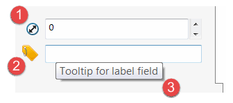
All generated controls have common properties which can be customized

- Control icon selected from the standard library of icons
- Custom control icon loaded from the image
- Tooltip of the control displayed on mouse hovering
Style
Common styles can be customized via ControlOptionsAttribute by decorating the specific properties in data model.
This attribute allows to define the alignment, position, size as well as background and foreground colours:
cs
[ControlOptions(backgroundColor: KnownColor.Green, textColor: KnownColor.Yellow)]
public string TextField { get; set; } = "Sample Text";
Attribution
Tooltip
Tooltip for controls can be set by applying the DescriptionAttribute
Standard Icon
Standard icon defined in BitmapLabelType_e enumeration can be set to control via StandardControlIconAttribute attribute.
cs
[Description("Depth Value")]
[StandardControlIcon(BitmapLabelType_e.Depth)]
public string Depth { get; set; }
Use the below map of all available standard icons:
![]()
- LinearDistance
- AngularDistance
- SelectEdgeFaceVertex
- SelectFaceSurface
- SelectVertex
- SelectFace
- SelectEdge
- SelectFaceEdge
- SelectComponent
- Diameter
- Radius
- LinearDistance1
- LinearDistance2
- Thickness1
- Thickness2
- LinearPattern
- CircularPattern
- Width
- Depth
- KFactor
- BendAllowance
- BendDeduction
- RipGap
- SelectProfile
- SelectBoundary
Custom Icon
Custom icon can be set via overloaded constructor of IconAttribute attribute
cs
[Icon(typeof(Resources), nameof(Resources.OffsetImage))]
public double Offset { get; set; }